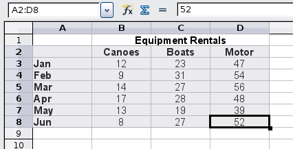
To demonstrate the process of making charts and graphs in Calc, we will use the small table of data below.


To create a chart, first highlight (select) the data to be included in the chart. The selection does not need to be in a single block, as shown below; you can also choose individual cells or groups of cells (columns or rows). See Introducing Calc for more about selecting cells and ranges of cells.


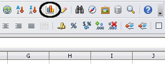
Next, open the Chart Wizard dialog using one of two methods.


Either method inserts a sample chart on the worksheet, opens the Formatting toolbar, and opens the Chart Wizard, as shown in the section below.
| Before choosing the Chart Wizard, place the cursor anywhere in the area of the data. The Chart Wizard will then do a fairly good job of guessing the range of the data. Just be careful that you have not included the title of your chart. |
The Chart Wizard includes a sample chart with your data. This sample chart updates to reflect the changes you make in the Chart Wizard.
The Chart Wizard has three main parts: a list of the steps involved in setting up the chart, the list of chart types, and the options for each chart type. At any time you can go back to a previous step and change selections.
Calc offers a choice of 10 basic chart types, with a few options for each type of chart. Options vary according to the type of chart you pick.
The first tier of choice is for two-dimensional (2D) charts. Only those types which are suitable for 3D (Column, Bar, Pie, and Area) give you an option to select a 3D look.
On the Choose a chart type page, select a type by clicking on its icon. The preview updates every time you select a different type of chart, and provides a good idea of what the finished chart will look like.
The current selection is highlighted (shown with a surrounding box) on the Choose a chart type page. The chart’s name is shown just below the icons. For the moment, we will stick with the Column chart and click on Next again.


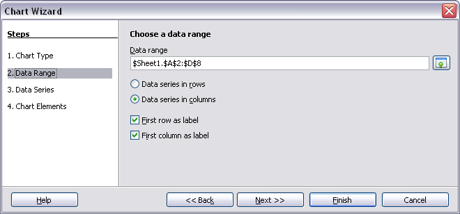
In Step 2, Data Range, you can manually correct any mistakes you have made in selecting the data.
On this page you can also change the way you are plotting the data by using the rows—rather than the columns—as data series. This is useful if you use a style of chart such as Donut or Pie to display your data.
Lastly, you can choose whether to use the first row or first column, or both, as labels on the axes of the chart.
You can confirm what you have done so far by clicking the Finish button, or click Next to change some more details of the chart.
We will click Next to see what we can do to our chart using the other pages of the Wizard.


On the Data Series page, you can fine tune the data that you want to include in the chart. Perhaps you have decided that you do not want to include the data for canoes. If so, highlight Canoes in the Data series box and click on Remove. Each named data series has its ranges and its individual Y-values listed. This is useful if you have very specific requirements for data in your chart, as you can include or leave out these ranges.


| You can click the Shrink button next to the Range for Name box to work on the spreadsheet itself. This is handy if your data ranges are larger than ours and the Chart Wizard is in the way. |
Another way to plot any unconnected columns of data is to select the first data series and then select the next series while holding down the Ctrl key. Or you can type the columns in the text boxes. The columns must be separated by semi-colons. Thus, to plot B3:B11 against G3:G11, type the selection range as B3:B11;G3:G11.
The two data series you are selecting must be in separate columns or rows. Otherwise Calc will assume that you are adding to the same data series.
Click Next to deal with titles, grids, and legends.
On the Chart Elements page, you can give your chart a title and, if desired, a subtitle. Use a title that draws the viewers’ attention to the purpose of the chart: what you want them to see. For example, a better title for this chart might be The Performance of Motor and Other Rental Boats.
It may be of benefit to have labels for the x axis or the y axis. This is where you give people an idea as to the proportion of your data. For example, if we put Thousands in the y axis label of our graph, it changes the scope of the chart entirely. For ease of estimating data you can also display the x or y axis grids by selecting the Display grids options.
You can leave out the legend or include it and place it to the left, right, top or bottom.
To finish the chart, click Finish.